Ranked Situationally Furious Words
Ranked Situational Fury served two purposes: a chance to play with Tufte CSS and an opportunity to expand vocabularies. There are so many non-ableist words that are great for describing feelings about situations, and creating the list was a great way to break up Tufte CSS and see how it works.
One of the neatest things about Tufte CSS is how it builds annotations. Here's an example from the demonstration page:
<p>
  In his later books
  <label for="sn-in-his-later-books" class="margin-toggle sidenote-number"></label>
  <input type="checkbox" id="sn-in-his-later-books" class="margin-toggle"/>
  <span class="sidenote">
    <a href="http://www.edwardtufte.com/tufte/books_be">
      <em>Beautiful Evidence</em>
    </a>
  </span>
  , Tufte starts each section with a bit of vertical space, a non-indented paragraph, and the first few words of the sentence set in small caps. ...
</p>
The really cool parts are what happens with that combination of label.margin-toggle.sidenote-number, label.margin-toggle, and span.sidenote. You can find these styles directly in tufte.css or follow along below. I'm going to be citing the styles out of order to pick apart what they do.
The label is hidden, but its .sidenote-number class gives it a trailing pseudoelement that does display, and uses a CSS counter to display which sidenote it is: (direct link)
.sidenote-number {
  counter-increment: sidenote-counter;
}
.sidenote-number:after,
.sidenote:before {
  content: counter(sidenote-counter) " ";
  position: relative;
  vertical-align: baseline;
}
.sidenote-number:after {
  content: counter(sidenote-counter);
  top: -0.5rem;
  left: 0.1rem;
}
.sidenote:before {
  content: counter(sidenote-counter) " ";
  top: -0.5rem;
}
This uses CSS counters to link the .sidenote with the .sidenote-number, so each have the same number. The counter increases by 1 every .sidenote-number, thanks to the counter-increment property. You can use the count of a counter as part of a content property, and these rules join the counter with a " " space.
So that's the numbering. It appears on all viewport widths, and the numbering provides a nice visual reference between the thing referenced in the text and the sidenote in the right-hand gutter of the page.
But why is there an input in the first place, or a label?
If you link a label to an input by setting the for attribute of the label to the id and name of the input, then clicking that label will focus the input. In the case of an input[type=checkbox], clicking the label will toggle the checkbox.
<label for="toggle-me">Touch/click me!</label>
<input id="toggle-me" name="toggle-me" />
There's a selector :checked, which only hits items that are checked. Combine that with a + adjacency selector, and you can toggle the visibility of elements without even using JavaScript:
.showy-hidey {
  display: none;
}
#check-me:checked + .showy-hidey {
  display: inline;
  color: red;
}
<label for="check-me">Touch/click me!</label>
<input id="check-me" name="check-me" type="checkbox" />
<span class="showy-hidey">ZOMG!</span>
ZOMG!
Now hide the input:
ZOMG!
By using a label, a hidden input, and the + adjacency selector, Tufte CSS lets you toggle the visibility of the annotation. They only do this on mobile-scale devices, but that's where (imho) having high-quality links to external resources are most important.
Linking to your sources is everywhere important, but the process of looking up an unlinked resource is a lot more annoying on a mobile device with its smaller UI. The copy-new-tab-paste-search workflow of <control-c> <control-t> <control-v> <enter> doesn't work when you don't have a keyboard, and "long press" actions by definition take long.
Tufte CSS initially hides the notes:
.sidenote,
.marginnote {
  display: none;
}
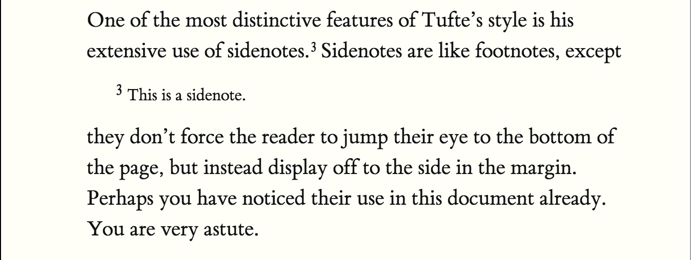
And then, when the margin-toggle is checked, displays their contents as a block that appears in the middle of the paragraph:
.margin-toggle:checked + .sidenote,
.margin-toggle:checked + .marginnote {
  display: block;
  float: left;
  left: 1rem;
  clear: both;
  width: 95%;
  margin: 1rem 2.5%;
  vertical-align: baseline;
  position: relative;
}

This is really cool.
So cool, in fact, that I'm going to steal it for use here on benlk.com. Mission "Learn about Tufte CSS" is a success.